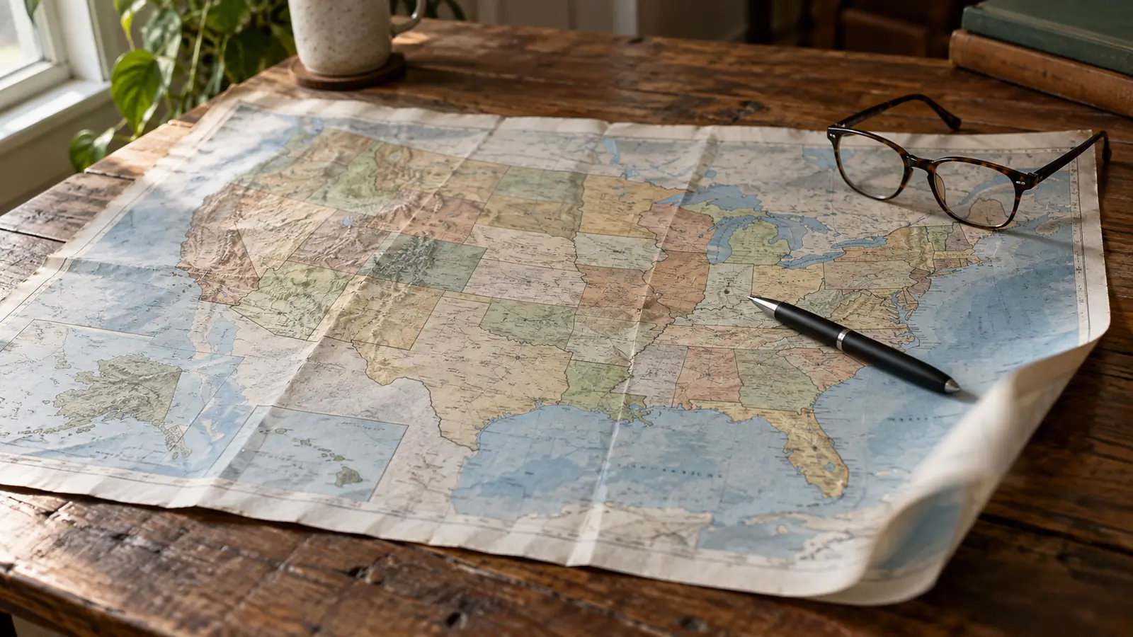

A tornado history map answers a question today's forecast cannot: not whether a tornado is coming this afternoon, but whether the place you live has a history of them, and how strong they were.
That's a different tool for a different decision — where to buy, whether to build a shelter, how seriously to take the season — and it is routinely confused with the day-ahead outlook.
Where the Data Comes From
NOAA's Storm Prediction Center maintains the national tornado database, running from 1950 to the present, with location, date, path and an intensity rating for each event. The Storm Events Database at the National Centers for Environmental Information holds the fuller record, and both are free.
Intensity is rated after the fact by surveying damage. The original Fujita scale was replaced by the Enhanced Fujita scale in 2007, which changed how wind speeds are estimated from the same damage. That matters when comparing decades: an event rated F4 in 1974 was assessed by different criteria than one rated EF4 today.
A tornado history map usa view built from this data is genuinely useful for seeing where paths cluster. It is much less useful for arguing about trends, for reasons worth being explicit about.
Why the Record Is Not a Trend
This is the part most maps leave out, and it changes how you should read every one of them.
A tornado only enters the record if someone reports it. In 1955, a weak tornado crossing empty farmland at dusk was frequently nobody's business. Today it is filmed by four people, reported by a spotter network, and surveyed afterwards.
The result is a database in which weaker events appear to increase steadily over time while stronger ones — which were always noticed, because they destroyed things — do not show the same climb. That is a reporting artefact sitting on top of whatever the real signal is.
So a raw count by decade tells you more about radar coverage, population and mobile phones than about the atmosphere. Researchers handle this by looking at strong tornadoes, at the number of days with tornadoes rather than the number of tornadoes, and at where clusters fall.
What does emerge from that work is a shift in geography: activity in the traditional Great Plains corridor has been comparatively flat while the Southeast — sometimes called Dixie Alley — has seen more. That region is more dangerous for reasons beyond meteorology: more night-time events, more trees blocking the view, more manufactured housing.
Which Map for Which Decision
A tornado risk map fema search usually means a real decision is being made — a house purchase, a shelter, an insurance conversation — and for that, the federal risk products are the right source rather than a news graphic.
FEMA's National Risk Index combines the natural hazard component with social vulnerability and community resilience, county by county. That combination is the honest way to look at it, because the same storm produces different outcomes in different places.
FEMA also publishes the design wind-speed maps that underpin safe room construction. If you are weighing a shelter, that is the document your builder should be working from — the standards, the costs and the installer question are in Tornado Shelters.
| Source | Use it for | Don't use it for |
|---|---|---|
| SPC tornado database, 1950 to now | Where paths have clustered near you | Arguing about trends over time |
| NCEI Storm Events Database | Detail on specific past events | Anything about today |
| FEMA National Risk Index | Comparing counties before a move or a build | Street-level precision |
| FEMA design wind-speed maps | What a safe room must be built to withstand | Estimating how often you'll use it |
| SPC convective outlook | Today and tomorrow | Long-term risk — wrong tool entirely |
When the season actually runs where you live, and why that has been shifting, is in Tornado Season.
Look your county up once, then act on it. A risk map you've read and done nothing about is a map you didn't need.
FAQ: Tornado History & Risk Maps
Where can I see tornado history for my area?
NOAA's Storm Prediction Center tornado database and the NCEI Storm Events Database both cover 1950 to the present and are free to search by location.
Are tornadoes becoming more frequent?
The record shows more reports, which is not the same thing. Detection, population and phones have all improved. Strong tornadoes, which were always noticed, don't show the same climb.
Where is Tornado Alley?
It's a nickname with no official boundary, traditionally the central Great Plains. Research points to increased activity further east, in the Southeast — which is more dangerous because of night-time events and housing stock.
What's the difference between F and EF ratings?
The Enhanced Fujita scale replaced the original Fujita scale in 2007, changing how wind speeds are estimated from damage. Ratings across that boundary are not directly comparable.
Which map should I use before buying a house?
FEMA's National Risk Index, which combines hazard with social vulnerability and community resilience by county — not a historical dot map alone.
Does this page show today's risk?
No, deliberately. For today and tomorrow, see Tornado Tracker & Live Map or the Live Emergency Map.
Sources
- NOAA Storm Prediction Center — national tornado database, 1950 to present
- NOAA NCEI — Storm Events Database
- FEMA — National Risk Index and design wind-speed maps
- National Weather Service — Enhanced Fujita scale and damage survey methodology
This page describes historical and long-term risk products and publishes no forecast of its own. When a warning is active, follow local authorities, National Weather Service alerts and emergency services before any general guidance. See our Editorial Policy and Sources & Fact-Checking.